Mappls Place Search
## Introduction
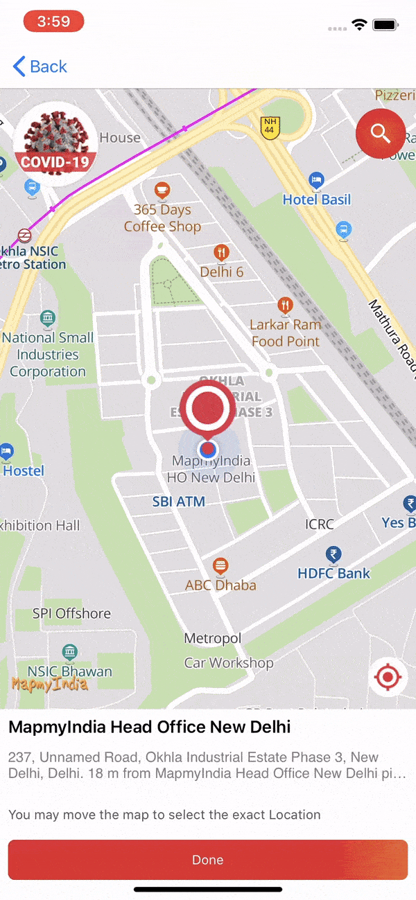
The Place Picker View is a UIView component that allows a user to pick a Place using an interactive map.
Place Picker View
The Place Picker View is a UIView component that allows a user to pick a Place using an interactive map.
Users can select a location which from center of map after succesfully reverse geocoding that location.
PlacePickerView is class whose instance can be created and can be added to ViewController. Below is sample code to understand:
Swift
import UIKit
import MapplsMap
import MapplsUIWidgets

class PlacePickerViewExampleVC: UIViewController {
    var mapView: MapplsMapView!
    var placePickerView: PlacePickerView!

    override func viewDidLoad() {
        super.viewDidLoad()
        mapView = MapplsMapView()
        // Do any additional setup after loading the view.
        placePickerView = PlacePickerView(frame: self.view.bounds, parentViewController: self, mapView: mapView)
        placePickerView.delegate = self
        self.view.addSubview(placePickerView)
    }
}

extension PlacePickerViewExampleVC: PlacePickerViewDelegate {
    func didFailedReverseGeocode(error: NSError?) {
        if let error = error {
            // failed for error
        } else {
            // No results found
        }
    }

    func didPickedLocation(placemark: MapplsGeocodedPlacemark) {
        // Add your code on successfully selecting location from picker view.
    }

    func didReverseGeocode(placemark: MapplsGeocodedPlacemark) {
        // Add your code on successfully retrieving a new location
    }
}
PlacePickerViewDelegate
As from above sample code PlacePickerViewDelegate is a protocol class which provides different delegate methods which can be used according to requirements.
Customize Place Picker
On adding instance of PlacePickerView it will load a default view with a map marker image on map But default view can be modified with help of some properties which are described as below:
markerView:
View of marker on map can be ovrriden by using property 'markerView'. This is type of UIView so it can accept custom designed view and UIImageView as well.
let customView = UIView(frame: CGRect(x: 0, y: 0, width: 50, height: 200))
customView.backgroundColor = .red
placePickerView.markerView = customView
isMarkerShadowViewHidden:
A shadow of marker is shows by defualt on dragging map. Visibility of this shadow can be changed by using property 'isMarkerShadowViewHidden'.
placePickerView.isMarkerShadowViewHidden = true
searchButtonBackgroundColor:
Background color of search button can be changed by using property 'searchButtonBackgroundColor'.
placePickerView.searchButtonBackgroundColor = .yellow
searchButtonImage:
Image of search button can be changed by using property 'searchButtonImage'.
placePickerView.searchButtonImage = UIImage(named: "userSearch")!
isSearchButtonHidden:
Visibility of search button can be changed by using property 'isSearchButtonHidden'.
placePickerView.isSearchButtonHidden = true
placeNameLabelTextColor:
Font color of label of name of place can be changed by using property 'placeNameLabelTextColor'.
placePickerView.placeNameLabelTextColor = .blue
addressLabelTextColor:
Font color of label of address of place can be changed by using property 'addressLabelTextColor'.
placePickerView.addressLabelTextColor = .green
pickerButtonTitleColor:
Font color of titile of button of select a location to pick can be changed by using property 'pickerButtonTitleColor'.
placePickerView.pickerButtonTitleColor = .blue
pickerButtonBackgroundColor:
Background color of button of select a location to pick can be changed by using property 'pickerButtonBackgroundColor'.
placePickerView.pickerButtonBackgroundColor = .blue
pickerButtonTitle:
Title of button of select a location to pick can be changed by using property 'pickerButtonTitle'.
placePickerView.pickerButtonTitle = "Pick it"
infoLabelTextColor:
Font color of label of tip info at bottom can be changed by using property 'infoLabelTextColor'.
placePickerView.infoLabelTextColor = .green
infoBottomViewBackgroundColor:
Background color of container of label of tip info at bottom can be changed by using property 'infoBottomViewBackgroundColor'.
placePickerView.infoBottomViewBackgroundColor = .green
placeDetailsViewBackgroundColor:
Background color of container of location info at bottom can be changed by using property 'placeDetailsViewBackgroundColor'.
placePickerView.placeDetailsViewBackgroundColor = .green
isBottomInfoViewHidden:
Visibility of tip info at bottom can be changed by using property 'isBottomInfoViewHidden'.
placePickerView.isBottomInfoViewHidden = true
isBottomPlaceDetailViewHidden:
Visibility of container of location info at bottom can be changed by using property 'isBottomPlaceDetailViewHidden'.
placePickerView.isBottomPlaceDetailViewHidden = true
isInitializeWithCustomLocation:
Initial location of place picker can be set by setting center of map but it will also required to set value of property 'isInitializeWithCustomLocation' to true.
placePickerView.isInitializeWithCustomLocation = true
placePickerView.mapView.setCenter(CLLocationCoordinate2DMake(28.612936, 77.229546), zoomLevel: 15, animated: false)
Attribution Appearance
MapplsAttributionsSettings
Code snippet to configure appearance of attribution of Autocomplete in PlacePickerView is below:
placePickerView = PlacePickerView(frame: self.view.bounds, parentViewController: self, mapView: mapView)

let attributionSettings = MapplsAttributionsSettings()
attributionSettings.attributionSize = .small
attributionSettings.attributionHorizontalContentAlignment = .left
attributionSettings.attributionVerticalPlacement = .after

placePickerView.autocompleteAttributionSettings = attributionSettings